Exercise 4
(c) 2016 Justin Bois. This work is licensed under a Creative Commons Attribution License CC-BY 4.0. All code contained herein is licensed under an MIT license.
This exercise was generated from a Jupyter notebook. You can download the notebook here.
Exercise 4.1: Long-term trends in hybridization of Darwin finches
Peter and Rosemary Grant have been working on the Galápagos island of Daphne Major for over forty years. During this time, they have collected lots and lots of data about physiological features of finches. Last year, they published a book with a summary of some of their major results (Grant P. R., Grant B. R., Data from: 40 years of evolution. Darwin's finches on Daphne Major Island, Princeton University Press, 2014). They made their data from the book publicly available via the Dryad Digital Repository.
We will investigate their measurements of beak depth (the distance, top to bottom, of a closed beak) and beak length (base to tip on the top) of Darwin's finches. We will look at data from two species, Geospiza fortis and Geospiza scandens. The Grants provided data on the finches of Daphne for the years 1973, 1975, 1987, 1991, and 2012. I have included the data in the files grant_1973.csv, grant_1975.csv, grant_1987.csv, grant_1991.csv, and grant_2012.csv. They are in almost exactly the same format is in the Dryad repository; I have only deleted blank entries at the end of the files.
Note: If you want to skip the munging (which is very valuable experience), you can go directly to part (d). You can load in the DataFrame you generate in parts (a) through (c) from the file ~/git/bootcamp/data/grant_complete.csv.
a) Load each of the files into separate Pandas DataFrames. You might want to inspect the file first to make sure you know what character the comments start with and if there is a header row.
b) We would like to merge these all into one DataFrame. The problem is that they have different header names, and only the 1973 file has a year entry (called yearband). This is common with real data. It is often a bit messy and requires some munging.
- First, change the name of the
yearbandcolumn of the 1973 data toyear. Also, make sure the year format is four digits, not two!- Next, add a
yearcolumn to the other fourDataFrames. You want tidy data, so each row in theDataFrameshould have an entry for the year.Change the column names so that all the
DataFrames have the same column names. I would choose column names
['band', 'species', 'beak length (mm)', 'beak depth (mm)', 'year']Concatenate the
DataFrames into a singleDataFrame. Be careful with indices! If you usepd.concat(), you will need to use theignore_index=Truekwarg. You might also need to use theaxiskwarg.
c) The band fields gives the number of the band on the bird's leg that was used to tag it. Are some birds counted twice? Are they counted twice in the same year? Do you think you should drop duplicate birds from the same year? How about different years? My opinion is that you should drop duplicate birds from the same year and keep the others, but I would be open to discussion on that. To practice your Pandas skills, though, let's delete only duplicate birds from the same year from the DataFrame. When you have made this DataFrame, save it as a CSV file.
Hint: The DataFrame methods duplicated() and drop_duplicates() will be useful.
After doing this work, it is worth saving your tidy DataFrame in a CSV document. To this using the to_csv() method of your DataFrame. Since the indices are uninformative, you should use the index=False kwarg. (I have already done this and saved it as ~/git/bootcamp/data/grant_complete.csv, which will help you do the rest of the exercise if you have problems with this part.)
d) Plot an ECDF of beak depths of Geospiza fortis specimens measured in 1987. Plot an ECDF of the beak depths of Geospiza scandens from the same year. These ECDFs should be on the same plot. On another plot, plot ECDFs of beak lengths for the two species in 1987. Do you see a striking phenotypic difference?
e) Perhaps a more informative plot is to plot the measurement of each bird's beak as a point in the beak depth-beak length plane. For the 1987 data, plot beak depth vs. beak width for Geospiza fortis as blue dots, and for Geospiza scandens as red dots. Can you see the species demarcation?
f) Do part (e) again for all years. Describe what you see. Do you see the changes in the differences between species (presumably as a result of hybridization)? In your plots, make sure all plots have the same range on the axes.
Exercise 4.2: Hacker stats on bee sperm data
Neonicotinoid pesticides are thought to have inadvertent effects on service-providing insects such as bees. A recent study of this was recently featured in the New York Times. The original paper is Straub, et al., Proc. Royal Soc. B 283(1835): 20160506. Straub and coworkers put their data in the Dryad repository, which means we can work with it!
(Do you see a trend here? If you want people to think deeply about your results, explore them, learn from them, in general further science with them, make your data publicly available. Strongly encourage the members of your lab to do the same.)
We will look at the weight of drones (male bees) using the data set stored in ~/git/bootcamp/data/bee_weight.csv and the sperm quality of drone bees using the data set stored in ~/git/bootcamp/data/bee_sperm.csv.
a) Load the drone weight data in as a Pandas DataFrame. Note that the unit of the weight is milligrams (mg).
b) Plot ECDFs of the drone weight for control and also for those exposed to pesticide. Do you think there is a clear difference?
c) Compute the mean drone weight for control and those exposed to pesticide. Compute 95% bootstrap confidence intervals on the mean.
d) Repeat parts (a)-(c) for drone sperm. Use the 'Quality' column as your measure. This is defined as the percent of sperm that are alive in a 500 µL sample.
e) As you have seen in your analysis in part (d), both the control and pesticide treatments have some outliers with very low sperm quality. This can tug heavily on the mean. So, get 95% bootstrap confidence intervals for the median sperm quality of the two treatments.
Exercise 4.3: Monte Carlo simulation of transcriptional pausing
In this exercise, we will put random number generation to use and do a Monte Carlo simulation. The term Monte Carlo simulation is a broad term describing techniques in which a large number of random numbers are generated to (approximately) calculate properties of probability distributions. In many cases the analytical form of these distributions is not known, so Monte Carlo methods are a great way to learn about them.
Transcription, the process by which DNA is transcribed into RNA, is key process in the central dogma of molecular biology. RNA polymerase (RNAP) is at the heart of this process. This amazing machine glides along the DNA template, unzipping it internally, incorporating ribonucleotides at the front, and spitting RNA out the back. Sometimes, though, the polymerase pauses and then backtracks, pushing the RNA transcript back out the front, as shown in the figure below, taken from Depken, et al., Biophys. J., 96, 2189-2193, 2009.
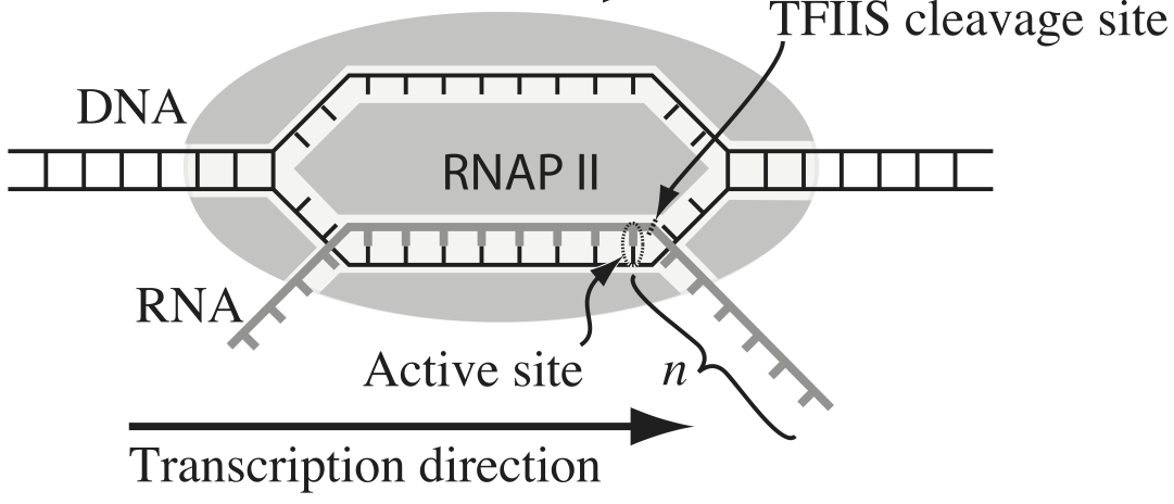
To escape these backtracks, a cleavage enzyme called TFIIS cleaves the bit on RNA hanging out of the front, and the RNAP can then go about its merry way.
Researchers have long debated how these backtracks are governed. Single molecule experiments can provide some much needed insight. The groups of Carlos Bustamante, Steve Block, and Stephan Grill, among others, have investigated the dynamics of RNAP in the absence of TFIIS. They can measure many individual backtracks and get statistics about how long the backtracks last.
One hypothesis is that the backtracks simply consist of diffusive-like motion along the DNA stand. That is to say, the polymerase can move forward or backward along the strand with equal probability once it is paused. This is a one-dimensional random walk. So, if we want to test this hypothesis, we would want to know how much time we should expect the RNAP to be in a backtrack so that we could compare to experiment.
So, we seek the probability distribution of backtrack times, $P(t_{bt})$, where $t_{bt}$ is the time spent in the backtrack. We could solve this analytically, which requires some sophisticated mathematics. But, because we know how to draw random numbers, we can just compute this distribution directly using Monte Carlo simulation!
We start at $x = 0$ at time $t = 0$. We "flip a coin," or choose a random number to decide whether we step left or right. We do this again and again, keeping track of how many steps we take and what the $x$ position is. As soon as $x$ becomes positive, we have existed the backtrack. The total time for a backtrack is then $\tau n_\mathrm{steps}$, where $\tau$ is the time it takes to make a step. Depken, et al., report that $\tau \approx 0.5$ seconds.
a) Write a function, backtrack_steps(), that computes the number of steps it takes for a random walker (i.e., polymerase) starting at position $x = 0$ to get to position $x = +1$. It should return the number of steps to take the walk.
b) Generate 10,000 of these backtracks in order to get enough samples out of $P(t_\mathrm{bt})$. (If you are interested in a way to really speed up this calculation, ask me about Numba.)
c) Use plt.hist() to plot a histogram of the backtrack times. Use the normed=True kwarg so it approximates a probability distribution function.
d) You saw some craziness in part (c). That is because, while most backtracks are short, some are reeeally long. So, instead, generate an ECDF of your samples and plot the ECDF with the $x$ axis on a logarithmic scale.
e) A probability distribution function that obeys a power law has the property
\begin{align} P(t_\mathrm{bt}) \propto t_\mathrm{bt}^{-a} \end{align}in some part of the distribution, usually for large $t_\mathrm{bt}$. If this is the case, the cumulative distribution is then
\begin{align} \mathrm{cdf}(t_\mathrm{bt}) \equiv F(t_\mathrm{bt})= \int_{-\infty}^{t_\mathrm{bt}} \mathrm{d}t_\mathrm{bt}'\,P(t_\mathrm{bt}') = 1 - \frac{c}{t_\mathrm{bt}^{a+1}}, \\ \phantom{blah} \end{align}where $c$ is some constant defined by the functional form of $P(t_\mathrm{bt})$ for small $t_\mathrm{bt}$ and the normalization condition. If $F$ is our cumulative histogram, we can check for power law behavior by plotting the complementary cumulative distribution (CCDF), $1 - F$, versus $t_\mathrm{bt}$. If a power law is in play, the plot will be linear on a log-log scale with a slope of $-a+1$.
Plot the complementary cumulative distribution function from your samples on a log-log plot. If it is linear, then the time to exit a backtrack is a power law.
f) By doing some mathematical heavy lifting, we know that, in the limit of large $t_{bt}$,
\begin{align} P(t_{bt}) \propto t^{-3/2}, \end{align}so the plot you did in part (e) should have a slope of $-1/2$ on a log-log plot. Is this what you see?
Notes: The theory to derive the probability distribution is involved. See, e.g., this. However, we were able to predict that we would see a great many short backtracks, and then see some very very long backtracks because of the power law distribution of backtrack times. We were able to do that just by doing a simple Monte Carlo simulation. There are many problem where the theory is really hard, and deriving the distribution is currently impossible, or the probability distribution has such an ugly expression that we can't really work with it. So, Monte Carlo methods are a powerful tool for generating predictions from simply-stated, but mathematically challenging, hypotheses.
Interestingly, many researchers thought (and maybe still do) there were two classes of backtracks: long and short. There may be, but the hypothesis that the backtrack is a random walk process is commensurate with seeing both very long and very short backtracks.