Lesson 26: Dashboards
[1]:
import pandas as pd
import numpy as np
import scipy.stats

import bokeh.io
import bokeh.layouts
import bokeh.models
import bokeh.plotting

notebook_url = 'localhost:8888'
bokeh.io.output_notebook()
Note: This notebook contains interactive plots. Full interactivity is not present in the HTML rendering of this notebook. This is because a Python engine needs to be running to update the plots. You can make dashboards that will run in other user’s browsers if you serve it and have the Python engine running on the server side. We will not cover this more advanced topic in the bootcamp.
We have seen that Bokeh allows interactivity in plots. You can zoom and hover over data points to get more information. Dashboarding involves constructing layouts of plots with interactivity, even beyond what we have seen so far. We can do more than just select which data we want to view; we can also trigger any calculation we wish based on mouse clicks or entered text within a graphic.
We will start with a simple exploration of how parameters affect a function.
A simple example
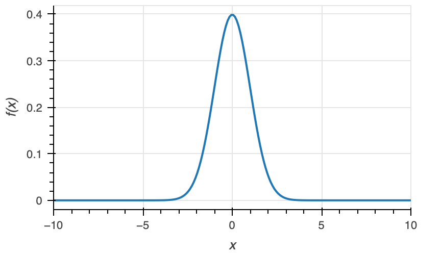
Let’s start by plotting the PDF of the Normal distribution.
[2]:
# Parameters; we'll start with standard Normal
mu = 0.0
sigma = 1.0

# Generate data
x = np.linspace(-10, 10, 200)
pdf = scipy.stats.norm.pdf(x, loc=mu, scale=sigma)

# Column data source for plot
source = bokeh.models.ColumnDataSource(dict(x=x, pdf=pdf))

# Build figure
p = bokeh.plotting.figure(
    frame_width=350,
    frame_height=200,
    x_axis_label='x',
    y_axis_label='f(x)',
    x_range=[-10, 10],
)

# Put line on plot
p.line(source=source, x='x', y='pdf', line_width=2);

# We will not show it because if it is in a dashboard, a given plot can only
# be shown there in a notebook. Instead, it's displayed as an image below.
Looks good, but what if we want to examine how the PDF changes with μ and σ? We could keep plotting it over and over, manually changing the values of µ and σ. Much more instructive would be to create sliders where we can change the values of the parameters and instantaneously see how the plot changes.
We can use Bokeh to make the sliders.
[3]:
mu_slider = bokeh.models.Slider(title="µ", start=-5.0, end=5.0, step=0.1, value=0.0, width=100)
sigma_slider = bokeh.models.Slider(title="σ", start=0.1, end=5.0, step=0.1, value=1.0, width=100)
The sliders are now created; we will add them to the plot area momentarily. Before we do that, we need to define what happens when we adjust a slider. Specifically, we want to change the data in source, which specifies where the line glyph is rendered on the plot. We therefore define a function to update source.data whenever the value of one of the sliders changes. Such a function is referred to as a callback. For callbacks that are triggered when slider values change, Bokeh requires
a call signature callback(attr, old, new), where attr is the attribute of the slider that changes, old is its old value, and new is its previous value. In this case, and often in practice, we do not use these arguments directly, since we will write a single callback that is called any time any of the sliders change.
[4]:
def norm_callback(attr, old, new):
    """Callback for updating data in Normal PDF plot."""
    # Pull the values off of each slider
    mu = mu_slider.value
    sigma = sigma_slider.value

    # Re-compute the y-values
    pdf = scipy.stats.norm.pdf(source.data['x'], loc=mu, scale=sigma)

    # Update the column data source
    source.data["pdf"] = pdf
Now we need to link the sliders to the callback. We do this using the on_change method of the sliders. The first argument is what attribute of the slider changes (in our case, it’s the 'value'), and the second argument is the callback function that gets called when the attribute changes.
[5]:
mu_slider.on_change('value', norm_callback)
sigma_slider.on_change('value', norm_callback)
Next, we need to lay out our plot and sliders today. The bokeh.layouts module offers convenient ways to do this. We will put the sliders to the right of the plot. The syntax below is self-explanatory.
[6]:
# Put the sliders one on top of the other
slider_layout = bokeh.layouts.column(
    bokeh.layouts.Spacer(height=30),
    mu_slider,
    bokeh.layouts.Spacer(height=15),
    sigma_slider,
)

# Put the sliders to the right of the plot
norm_layout = bokeh.layouts.row(
    p,
    bokeh.layouts.Spacer(width=15),
    slider_layout
)
Finally, because this is a more complex graphic that requires calling Python functions upon updating, we need to make an app. To make the app, we used the function below.
[7]:
def norm_app(doc):
    doc.add_root(norm_layout)
Now, we are ready to show the app. To show it, we need to specify the URL of the notebook so that the callback communicates properly with this notebook. The notebook_url keyword argument of bokeh.io.show() is a string containing the root URL for the notebook. In this case, I have specified it in the top cell as 'localhost:8888'.
[8]:
bokeh.io.show(norm_app, notebook_url=notebook_url)
Pieces of a Bokeh dashboard
Let us rehash what we did to create the dashboard. To specify a dashboard allowing us to interact with plots, we must provide the following.
The plot or plots themselves.
The widgets. Widgets for parameter values are primarily sliders, which enable you to vary parameter values by clicking and dragging. We can also make use of other widgets such as toggle, radio buttons, and drop menus. The Bokeh documentation provides good instruction on what widgets are available and how to use them.
The callback function. This is a function that is executed whenever a widget changes value. Most of the time, we use it to update a ColumnDataSource of a plot. You may have more than one callback functions for different widgets and also for changes in the range of the axis of the plot due to zooming.
The layout. This is the spatial arrangement of the plots and widgets. Again, the Bokeh documentation on layouts is a useful reference.
The app. Bokeh will create an application that can be embedded in a notebook or serves as its own page in a browser. To create it, you need to make a simple function that adds the layout you built to the document that Bokeh will make into an app. (This sounds a lot more complicated than it is; it is as simple as coding up the
norm_app()function above.)
Using dashboards to explore parameters
Recall from a previous exercise that we investigated the fold change in gene expression as a function of repressor copy number \(R\) and inducer concentration \(c\). The theoretical function, based on an MWC model, was
\begin{align} \text{fold change} = \left[1 + \frac{\frac{R}{K}\left(1 + c/K_\mathrm{d}^\mathrm{A}\right)^2}{\left(1 + c/K_\mathrm{d}^\mathrm{A}\right)^2 + K_\mathrm{switch}\left(1 + c/K_\mathrm{d}^\mathrm{I}\right)^2}\right]^{-1}. \end{align}
There are quite a few parameters here.
Parameter |
Description |
|---|---|
\(K_\mathrm{d}^\mathrm{A}\) |
dissoc. const. for active repressor binding IPTG |
\(K_\mathrm{d}^\mathrm{I}\) |
dissoc. const. for inactive repressor binding IPTG |
\(K_\mathrm{switch}\) |
equil. const. for switching active/inactive |
\(K\) |
dissoc. const. for active repressor binding operator |
\(R\) |
number of repressors in cell |
This is a complicated function of these parameters, and we might want to see how the fold change vs. inducer concentration curve varies based on various parameter values. Dashboarding comes in very handy for this kind of application.
To build our dashboard, we start by defining functions to compute the fold change as a function of the IPTG concentration and the parameters.
[9]:
def bohr_parameter(c, R, K, KdA, KdI, Kswitch):
    """Compute Bohr parameter based on MWC model."""
    # Big nasty argument of logarithm
    log_arg = (1 + c / KdA) ** 2 / (
        (1 + c / KdA) ** 2 + Kswitch * (1 + c / KdI) ** 2
    )

    return -np.log(R / K) - np.log(log_arg)


def fold_change(c, R, K, KdA, KdI, Kswitch):
    """Compute theoretical fold change for MWC model."""
    return 1 / (1 + np.exp(-bohr_parameter(c, R, K, KdA, KdI, Kswitch)))
Next, we define our sliders. For convenience, we will store the sliders in a dictionary.
As we explore this function, we would like the parameter to vary on a logarithmic scale. Bokeh does not allow logarithmic scale sliders (tough there is a hack to get around this that we will discuss in the Bokeh styling lesson).
[10]:
sliders = dict(
    log_R_slider=bokeh.models.Slider(
        title="log₁₀ R (1/cell)", start=0, end=3, step=0.1, value=2
    ),
    log_K_slider=bokeh.models.Slider(
        title="log₁₀ K (1/cell)", start=-6, end=3, step=0.1, value=0
    ),
    log_KdA_slider=bokeh.models.Slider(
        title="log₁₀ KdA (1/mM)", start=-6, end=3, step=0.1, value=-2
    ),
    log_KdI_slider=bokeh.models.Slider(
        title="log₁₀ KdI (1/mM)", start=-6, end=3, step=0.1, value=-2
    ),
    log_Kswitch_slider=bokeh.models.Slider(
        title="log₁₀ Kswitch", start=-3, end=6, step=0.1, value=1,
    ),
)
Now, we’ll generate the plot, defining a ColumnDataSource that we can manipulate in callbacks.
[11]:
# Concentration of inducer
c = np.logspace(-6, 2, 200)

# Take parameters from slider values
params = 10.0 ** np.array([slider.value for _, slider in sliders.items()])

# Fold change
fc = fold_change(c, *params)

# Data source
source = bokeh.models.ColumnDataSource(dict(c=c, fc=fc))

# Build the plot
p = bokeh.plotting.figure(
    frame_height=250,
    frame_width=350,
    x_axis_type="log",
    x_axis_label="[IPTG] (mM)",
    y_axis_label="fold change",
    x_range=[c.min(), c.max()],
    y_range=[-0.05, 1.05],
)

# Plot the curve
p.line(source=source, x="c", y="fc", line_width=2);
Next, we will write a callback to update the data and link the callback to the sliders.
[12]:
def induction_callback(attr, old, new):
    """Callback for updating induction plot."""
    # Take parameters from slider values
    params = 10.0 ** np.array([slider.value for _, slider in sliders.items()])

    # Update source
    source.data['fc'] = fold_change(source.data['c'], *params)


# Link the callback to the sliders
for _, slider in sliders.items():
    slider.on_change('value', induction_callback)
Finally, we can lay out our dashboard and explore the function.
[13]:
induction_layout = bokeh.layouts.row(
    p,
    bokeh.models.Spacer(width=15),
    bokeh.layouts.column(
        *[slider for _, slider in sliders.items()],
        width=200,
    ),
)

def induction_app(doc):
    doc.add_root(induction_layout)

bokeh.io.show(induction_app, notebook_url=notebook_url)
In playing with the sliders, we see that a difference between \(K_\mathrm{d}^\mathrm{A}\) and \(K_\mathrm{d}^\mathrm{I}\) is required to get repression. As we would expect, we need \(K_\mathrm{d}^\mathrm{I} < K_\mathrm{d}^\mathrm{A}\) in order to get more repression with increasing IPTG concentration.
The effects of the other parameters are more complicated and interdependent, but can nonetheless be explored by varying the sliders.
Exploring a data set
As an example of dashboarding put to use to explore a data set, we turn again to the data set from Beattie, et al. studying how sleep deprivation affects facial matching ability. Let’s load in the data set and take a look to remind ourselves of the variables.
[14]:
df = pd.read_csv('data/gfmt_sleep.csv', na_values='*')

# Add column for insomnia
df['insomnia'] = df['sci'] <= 16

df.head()
[14]:
| participant number | gender | age | correct hit percentage | correct reject percentage | percent correct | confidence when correct hit | confidence when incorrect hit | confidence when correct reject | confidence when incorrect reject | confidence when correct | confidence when incorrect | sci | psqi | ess | insomnia | |
|---|---|---|---|---|---|---|---|---|---|---|---|---|---|---|---|---|
| 0 | 8 | f | 39 | 65 | 80 | 72.5 | 91.0 | 90.0 | 93.0 | 83.5 | 93.0 | 90.0 | 9 | 13 | 2 | True |
| 1 | 16 | m | 42 | 90 | 90 | 90.0 | 75.5 | 55.5 | 70.5 | 50.0 | 75.0 | 50.0 | 4 | 11 | 7 | True |
| 2 | 18 | f | 31 | 90 | 95 | 92.5 | 89.5 | 90.0 | 86.0 | 81.0 | 89.0 | 88.0 | 10 | 9 | 3 | True |
| 3 | 22 | f | 35 | 100 | 75 | 87.5 | 89.5 | NaN | 71.0 | 80.0 | 88.0 | 80.0 | 13 | 8 | 20 | True |
| 4 | 27 | f | 74 | 60 | 65 | 62.5 | 68.5 | 49.0 | 61.0 | 49.0 | 65.0 | 49.0 | 13 | 9 | 12 | True |
The metadata for each subject is the participant number, gender, age, sleep indicators (SCI, PSQI, and ESS), and the column we added to specify if the subject suffers from insomnia. The measurements for each subject are the various percentages.
Because the data is high-dimensional, it is difficult to visualize all of the data at once. We would like drop-down menus to choose what we want to plot and then have the plot update. Furthermore, we would like to choose a categorical column, such as 'insomnia' or 'gender' to use to color the glyphs. Let’s go about building this dashboard.
As a first, step, we will get a list of columns we want in the drop-down menus.
[15]:
# Options for x- and y- selector; omit part. num., gender, and insomnia
xy_options = list(
    df.columns[~df.columns.isin(["participant number", "gender", "insomnia"])]
)
Now, we’ll build our drop-down menus, constructed using bokeh.models.Select instances.
[16]:
x_selector = bokeh.models.Select(
    title="x", options=xy_options, value="percent correct", width=200,
)

y_selector = bokeh.models.Select(
    title="y", options=xy_options, value="confidence when correct", width=200,
)

colorby_selector = bokeh.models.Select(
    title="color by", options=["none", "gender", "insomnia",], value="none", width=200,
)
Next, we’ll make a ColumnDataSource. We just need an x-value and a y-value, plus a column for coloring the glyphs, since this is all the plot depends upon. We will adjust the entries in the 'x' and 'y' columns of the ColumnDataSource from the data frame df according to the values of the selector widgets.
[17]:
source = bokeh.models.ColumnDataSource(dict(x=df[x_selector.value], y=df[y_selector.value]))

# Add a column for colors; for now, all Bokeh's default blue
source.data['color'] = ['#1f77b3'] * len(df)
Now we can make the plot.
[18]:
p = bokeh.plotting.figure(
    frame_height=250,
    frame_width=250,
    x_axis_label=x_selector.value,
    y_axis_label=y_selector.value,
)

# Populate gylphs
circle = p.circle(source=source, x="x", y="y", color="color")
With the plot in place, we can write a callback.
[19]:
def gfmt_callback(attr, new, old):
    """Callback for updating plot of GMFT results."""
    # Update color column
    if colorby_selector.value == "none":
        source.data["color"] = ["#1f77b3"] * len(df)
    elif colorby_selector.value == "gender":
        source.data["color"] = [
            "#1f77b3" if gender == "f" else "#ff7e0e"
            for gender in df["gender"]
        ]
    elif colorby_selector.value == 'insomnia':
        source.data["color"] = [
            "#1f77b3" if insomnia else "#ff7e0e"
            for insomnia in df["insomnia"]
        ]

    # Update x-data and axis label
    source.data["x"] = df[x_selector.value]
    p.xaxis.axis_label = x_selector.value

    # Update x-data and axis label
    source.data["y"] = df[y_selector.value]
    p.yaxis.axis_label = y_selector.value
Now that we have the callback, we can link the selectors to the callback.
[20]:
colorby_selector.on_change("value", gfmt_callback)
x_selector.on_change("value", gfmt_callback)
y_selector.on_change("value", gfmt_callback)
And now we can build the layout and play with the app!
[21]:
gfmt_layout = bokeh.layouts.row(
    p,
    bokeh.layouts.Spacer(width=15),
    bokeh.layouts.column(
        x_selector,
        bokeh.layouts.Spacer(height=15),
        y_selector,
        bokeh.layouts.Spacer(height=15),
        colorby_selector,
    ),
)

def gfmt_app(doc):
    doc.add_root(gfmt_layout)

bokeh.io.show(gfmt_app, notebook_url=notebook_url)
Serving an app
While having a full notebook is desirable because of the rich display of text in Markdown cells, it is sometimes desirable to have a stand-alone tab in your browser with a dashboard to manipulate. To do this, you need to create a .py file with the code you need to generate your graphic. To do the example above, you can place the code below in a file called gfmt_app.py.
import pandas as pd
import numpy as np

import bokeh.layouts
import bokeh.models
import bokeh.plotting

# Read in data
df = pd.read_csv('data/gfmt_sleep.csv', na_values='*')

# Add column for insomnia
df['insomnia'] = df['sci'] <= 16

# Options for x- and y- selector; omit part. num., gender, and insomnia
xy_options = list(
    df.columns[~df.columns.isin(["participant number", "gender", "insomnia"])]
)

# Selector widgets
x_selector = bokeh.models.Select(
    title="x", options=xy_options, value="percent correct", width=200,
)

y_selector = bokeh.models.Select(
    title="y", options=xy_options, value="confidence when correct", width=200,
)

colorby_selector = bokeh.models.Select(
    title="color by", options=["none", "gender", "insomnia",], value="none", width=200,
)

# Column data source
source = bokeh.models.ColumnDataSource(dict(x=df[x_selector.value], y=df[y_selector.value]))

# Add a column for colors; for now, all Bokeh's default blue
source.data['color'] = ['#1f77b3'] * len(df)

# Make the plot
p = bokeh.plotting.figure(
    frame_height=250,
    frame_width=250,
    x_axis_label=x_selector.value,
    y_axis_label=y_selector.value,
)

# Populate gylphs
circle = p.circle(source=source, x="x", y="y", color="color")


def gfmt_callback(attr, new, old):
    """Callback for updating plot of GMFT results."""
    # Update color column
    if colorby_selector.value == "none":
        source.data["color"] = ["#1f77b3"] * len(df)
    elif colorby_selector.value == "gender":
        source.data["color"] = [
            "#1f77b3" if gender == "f" else "#ff7e0e"
            for gender in df["gender"]
        ]
    elif colorby_selector.value == 'insomnia':
        source.data["color"] = [
            "#1f77b3" if insomnia else "#ff7e0e"
            for insomnia in df["insomnia"]
        ]

    # Update x-data and axis label
    source.data["x"] = df[x_selector.value]
    p.xaxis.axis_label = x_selector.value

    # Update x-data and axis label
    source.data["y"] = df[y_selector.value]
    p.yaxis.axis_label = y_selector.value


# Connect selectors to callback
colorby_selector.on_change("value", gfmt_callback)
x_selector.on_change("value", gfmt_callback)
y_selector.on_change("value", gfmt_callback)

# Build layout
gfmt_layout = bokeh.layouts.row(
    p,
    bokeh.layouts.Spacer(width=15),
    bokeh.layouts.column(
        x_selector,
        bokeh.layouts.Spacer(height=15),
        y_selector,
        bokeh.layouts.Spacer(height=15),
        colorby_selector,
    ),
)


def gfmt_app(doc):
    doc.add_root(gfmt_layout)


# Build the app in the current doc
gfmt_app(bokeh.plotting.curdoc())
Note that only the very last line is new from the code we built in this notebook. This adds the app to the current document being displayed by the Bokeh server in your browser.
Finally, to serve your app in the browser, do
bokeh serve --show gfmt_app.py
on the command line.
Conclusions
There are many more directions you can go with dashboards. In particular, if there is a type of experiment you do often in which you have multifaceted data, you may want to build a dashboard into which you can automatically load your data and display it for you to explore. This can greatly expedite your work, and can also be useful for sharing your data with others, enabling them to rapidly explore it as well.
That said, it is important to constantly be rethinking how you visualize and analyze the data you collect. You do not want the displays of a dashboard you set up a year ago have undo influence on your thinking right now.
Computing environment
[22]:
%load_ext watermark
%watermark -v -p numpy,scipy,pandas,bokeh,jupyterlab
Python implementation: CPython
Python version       : 3.9.12
IPython version      : 8.3.0

numpy     : 1.21.5
scipy     : 1.7.3
pandas    : 1.4.2
bokeh     : 2.4.2
jupyterlab: 3.3.2