Lesson 20: High level plotting
[1]:
import numpy as np
import pandas as pd

import bokeh_catplot

import bokeh.plotting
import bokeh.io

bokeh.io.output_notebook()
In this lesson, do some plotting with a high-level package Bokeh-catplot. You should have installed it in Lesson 0.
We will use the frog tongue data set from Kleinteich and Gorb that we used in our exercises with Pandas. Let’s get the data frame loaded in so we can be on our way.
[2]:
df = pd.read_csv('data/frog_tongue_adhesion.csv', comment='#')

# Have a look so we remember
df.head()
[2]:
| date | ID | trial number | impact force (mN) | impact time (ms) | impact force / body weight | adhesive force (mN) | time frog pulls on target (ms) | adhesive force / body weight | adhesive impulse (N-s) | total contact area (mm2) | contact area without mucus (mm2) | contact area with mucus / contact area without mucus | contact pressure (Pa) | adhesive strength (Pa) | |
|---|---|---|---|---|---|---|---|---|---|---|---|---|---|---|---|
| 0 | 2013_02_26 | I | 3 | 1205 | 46 | 1.95 | -785 | 884 | 1.27 | -0.290 | 387 | 70 | 0.82 | 3117 | -2030 |
| 1 | 2013_02_26 | I | 4 | 2527 | 44 | 4.08 | -983 | 248 | 1.59 | -0.181 | 101 | 94 | 0.07 | 24923 | -9695 |
| 2 | 2013_03_01 | I | 1 | 1745 | 34 | 2.82 | -850 | 211 | 1.37 | -0.157 | 83 | 79 | 0.05 | 21020 | -10239 |
| 3 | 2013_03_01 | I | 2 | 1556 | 41 | 2.51 | -455 | 1025 | 0.74 | -0.170 | 330 | 158 | 0.52 | 4718 | -1381 |
| 4 | 2013_03_01 | I | 3 | 493 | 36 | 0.80 | -974 | 499 | 1.57 | -0.423 | 245 | 216 | 0.12 | 2012 | -3975 |
High level plotting and rendering with Bokeh
HoloViews is an excellent high-level plotting package that can use Bokeh to render plots. In my view, it is one of the best high-level plotting packages in the Python plotting landscape. We will work with HoloViews in a future lesson, but in this lesson, we will do our high-level plotting using a package I wrote called Bokeh-catplot.
Why are we using this package and not HoloViews? In next year’s bootcamp, I am almost certain we will use HoloViews exclusively for high-level plotting because I suspect that most of the functionality in Bokeh-catplot will be incorporated into HoloViews. Bokeh-catplot exists because HoloViews lacks some important functionality. (More on these very important plot types in a moment; don’t worry if you don’t know what they are just yet.)
It does not natively make ECDFs, but will eventually. I’m actually the one who should do this, and my apologies for not having it done.
It does not (easily, or as far as I can tell) enable an axis with more than one categorical variable for strip plots (though it does for box plots).
There are all relatively minor fixes for HoloViews, which will likely have this functionality in the near future.
Nonetheless, ECDFs and horizontal strip plots are important visualizations and I advocate using them often, and Bokeh-catplot provides a high-level way to render them using Bokeh.
Plots with categorical variables
Let us first consider the different kinds of data we may encounter as we think about constructing a plot.
Quantitative data may have continuously varying (and therefore ordered) values.
Categorical data has discrete, unordered values that a variable can take.
Ordinal data has discrete, ordered values. Integers are a classic example.
Temporal data refers to time, which can be represented as dates.
In practice, ordinal data can be cast as quantitative or treated as categorical with an ordering enforced on the categories (e.g., categorical data [1, 2, 3] becomes ['1', '2', '3'].). Temporal data can also be cast as quantitative, (e.g., second from the start time). We will therefore focus out attention on quantitative and categorical data.
When we made scatter plots in the previous lesson, both types of data were quantitative. We did actually incorporate categorical information in the form of colors of the glyph (insomniacs and normal sleepers being colored differently) and in tooltips.
But what if we wanted a single type of measurement, say impact force, for each frog? Here, we have the quantitative impact force data and the categorical frog ID data. One of our axes is now categorical.
Bar graph
To demonstrate how to set up a categorical axis with Bokeh, I will make a bar graph of the mean impact force for each of the four frogs. But before I even begin this, I will give you the following piece of advice: Don’t make bar graphs. More on that in a moment.
Before we do that, we need to compute the means from the inputted data frame.
[3]:
df_mean = df.groupby('ID')['impact force (mN)'].mean().reset_index()

# Take a look
df_mean
[3]:
| ID | impact force (mN) | |
|---|---|---|
| 0 | I | 1530.20 |
| 1 | II | 707.35 |
| 2 | III | 550.10 |
| 3 | IV | 419.10 |
To set up a categorical axis, you need to specify the x_range (or y_range if you want the y-axis to be categorical) as a list with the categories you want on the axis when you instantiate the figure. I will make a horizontal bar graph, so I will specify y_range. Also, when I instantiate this figure, because it is not very tall and I do not want the reset tool cut off, I will also explicitly set the tools I want in the toolbar.
[4]:
p = bokeh.plotting.figure(
    frame_height=200,
    frame_width=400,
    x_axis_label='impact force (mN)',
    y_range=df_mean['ID'].unique()[::-1],
    tools='pan,wheel_zoom,save,reset'
)
Now that we have the figure, we can put the bars on. The p.hbar() method populates the figure with horizontal bar glyphs. The right kwarg says what column of the data source dictates how far to the right to show the bar, while the height kwarg says how think the bars are.
I will also ensure the quantitative axis starts at zero and turn off the grid lines on the categorical axis, which is commonly done.
[5]:
p.hbar(
    source=df_mean,
    y='ID',
    right='impact force (mN)',
    height=0.6
)

# Turn off gridlines on categorical axis
p.ygrid.grid_line_color = None

# Start axes at origin on quantitative axis
p.x_range.start = 0

bokeh.io.show(p)
We similarly make vertical bar graphs specifying x_range and using p.vbar().
[6]:
p = bokeh.plotting.figure(
    frame_height=250,
    frame_width=250,
    y_axis_label='impact force (mN)',
    x_range=df_mean['ID'].unique(),
)

p.vbar(
    source=df_mean,
    x='ID',
    top='impact force (mN)',
    width=0.6
)

p.xgrid.grid_line_color = None
p.y_range.start = 0

bokeh.io.show(p)
Bokeh-catplot
Generating the bar graphs was not too painful, even tough we used Bokeh, a low-level plotting library. We would like to make plots more declaratively. We do not want to have to explicitly pre-process the data, set up the categorical axis, etc. We would like to just provide a data set, say which column(s) is/are categorical and which is quantitative, and then just get our plot. As I mentioned before, Holoviews is excellent for this purpose, but we will use Bokeh-catplot as our high-level package for making plots for now.
Bokeh-catplot generates plots from tidy data frames where one or more columns contains categorical data and the column of interest in the plot is quantitative.
There are four types of plots that Bokeh-catplot can generate. As you will see, all four of these modes of plotting are meant to give a picture about how the quantitative measurements are distributed for each category.
Plots with a categorical axis
Box plots:
bokeh_catplot.box()Strip plots:
bokeh_catplot.strip()
Plots without a categorical axis
Histograms:
bokeh_catplot.histogram()ECDFs:
bokeh_catplot.ecdf()
The first three arguments of each of these functions are necessary to build the plot. They are:
data: A tidy data framecats: A list of columns in the data frame that are to be considered as categorical variables in the plot. IfNone, a single box, strip, histogram, or ECDF is plotted.val: The column of the data frame to be treated as the quantitative variable.
With this in mind, we will put Bokeh-catplot to use on the frog data set.
Box plots with Bokeh-catplot
As I discuss below, bar graphs are almost never a good choice for visualization. You distill all of the information in the data set down to one or two summary statistics, and then use giant glyphs to show them. As a start for improvement, you could distill the data set down to five or so summary statistics and show those graphically, as opposed to just one or two.
Box plots provide such a summary. I will first make one using bokeh_catplot.box() and then describe how a box plot is interpreted.
[7]:
p = bokeh_catplot.box(
    data=df,
    cats='ID',
    val='impact force (mN)'
)

bokeh.io.show(p)
The line in the middle of each box is the median and the top and bottom of the box at the 75th and 25th percentiles, respectively. The distance between the 25th and 75th percentiles is called the interquartile range, or IQR. The whiskers of the box plot extend to the most extreme data point within 1.5 times the interquartile range. If any data points are more extreme than the end of the whisker, they are shown individually, and are often referred to as outliers.
A box plot can use a useful visualization if you have many data points and it is difficult to plot them all. I rarely find that there are situations where all data cannot be plotted, either with strip plots of ECDFs, which we will cover in a moment, so I generally do not use box plots. Nonetheless, I do not find them too objectionable, as they effectively display important nonparametric summary statistics of your data set.
Plot all your data
Box plots summarize a data set with summary statistics, but what not plot all your data? You work hard to acquire them. You should show them all. This is a mantra to live by.
Plot all of your data.
Let’s do that now.
Strip plots
A strip plot is like a scatter plot; it puts a glyph for every measured data point. The only difference is that one of the axes is categorical. In this case, you are plotting all of your data.
[8]:
p = bokeh_catplot.strip(
    data=df,
    cats='ID',
    val='impact force (mN)'
)

bokeh.io.show(p)
This is a good plot to make since you are plotting all of your data, but it does have the problem that you cannot tell if multiple data points overlap.
Histograms
In plotting all of our data in a strip plot, we can roughly see how the data are distributed. There are more measurements where there are more glyphs. We ofter seek to visualize the distribution of the data. Histograms are commonly used for this. They are typically interpreted to as an empirical representation of the probability density function.
[9]:
p = bokeh_catplot.histogram(
    data=df,
    cats='ID',
    val='impact force (mN)'
)

bokeh.io.show(p)
ECDFs
I just mentioned that histograms are typically used to display how data are distributed, but it was hard to make out the distributions in the above plot, partly because we do not have very many measurements. As another example I will generate Normally distributed data and plot the histogram. (We will learn how to generate data like this when we study random number generation with NumPy in a future lesson. For not, this is for purposes of discussing plotting options.)
[10]:
# Generate normally distributed data
np.random.seed(353926)
df_norm = pd.DataFrame(data={'x': np.random.normal(size=500)})

# Plot the histogram
p = bokeh_catplot.histogram(
    data=df_norm,
    cats=None,
    val='x'
)

bokeh.io.show(p)
This looks similar to the standard Normal curve we are used to seeing and is a useful comparison to a probability density function (PDF). However, Histograms suffer from binning bias. By binning the data, you are not plotting all of them. In general, if you can plot all of your data, you should. For that reason, I prefer not to use histograms for studying how data are distributed, but rather prefer to use ECDFs, which enable plotting of all data.
The ECDF evaluated at x for a set of measurements is defined as
\begin{align} \text{ECDF}(x) = \text{fraction of measurements } \le x. \end{align}
While the histogram is an attempt to visualize a probability density function (PDF) of a distribution, the ECDF visualizes the cumulative density function (CDF). The CDF, \(F(x)\), and PDF, \(f(x)\), both completely define a univariate distribution and are related by
\begin{align} f(x) = \frac{\mathrm{d}F}{\mathrm{d}x}. \end{align}
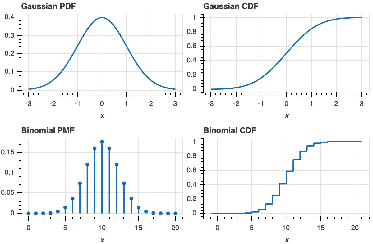
The definition of the ECDF is all that you need for interpretation. Once you get used to looking at CDFs, they will become as familiar to you as PDFs. A peak in a PDF corresponds to an inflection point in a CDF.
To make this more clear, let us look at plot of a PDF and ECDF for familiar distributions, the Gaussian and Binomial.
Now that we know how to interpret ECDFs, lets plot the ECDF for our dummy Normally-distributed data.
[11]:
p = bokeh_catplot.ecdf(
    data=df_norm,
    cats=None,
    val='x',
)

bokeh.io.show(p)
Now that we understand what an ECDF is and how to plot it, let’s make a set of ECDFs for our frog data.
[12]:
p = bokeh_catplot.ecdf(
    data=df,
    cats='ID',
    val='impact force (mN)'
)

bokeh.io.show(p)
Each dot in the ECDF is a single data point that we measured. Given the above definition of the ECDF, it is defined for all real \(x\). So, formally, the ECDF is a continuous function (with discontinuous derivatives at each data point). So, it should be plotted like a staircase according to the formal definition. We can plot it that way using the style keyword argument.
[13]:
p = bokeh_catplot.ecdf(
    data=df,
    cats='ID',
    val='impact force (mN)',
    style='staircase',
)

bokeh.io.show(p)
This is still plotting all of your data. The concave corners of the staircase correspond to the measured data. This can be seen by overlaying the “dot” version of the ECDFs.
[14]:
p = bokeh_catplot.ecdf(
    data=df,
    cats='ID',
    val='impact force (mN)',
    p=p
)

bokeh.io.show(p)
Customization with Bokeh-catplot
You may have noticed in the discussion of ECDFs that I introduced some new keyword arguments, style and p. In fact, each of the four plotting functions also has the following additional optional keyword arguments.
palette: A list of hex colors to use for coloring the markers for each category. By default, it uses thecolorcet.b_glasbey_category10palette from the colorcet package.order: If specified, the ordering of the categories to use on the categorical axis and legend (if applicable). Otherwise, the order of the inputted data frame is used.p: If specified, thebokeh.plotting.Figureobject to use for the plot. If not specified, a new figure is created.
The respective plotting functions also have kwargs that are specific to each (such as style for bokeh_catplot.ecdf(). Examples highlighting some, but not all, customizations follow. You can find out what kwargs are available for each function by reading their doc strings, e.g., with
bokeh_catplot.box?
Any kwargs not in the function call signature are passed to bokeh.plotting.figure() when the figure is instantiated.
Customizing box plots
We can also have horizontal box plots.
[15]:
p = bokeh_catplot.box(
    data=df,
    cats='ID',
    val='impact force (mN)',
    horizontal=True,
)

bokeh.io.show(p)
We can independently specify properties of the marks using box_kwargs, whisker_kwargs, median_kwargs, and outlier_kwargs. For example, say we wanted our colors to be Betancourt red, and that we wanted the outliers to also be that color and use diamond glyphs.
[16]:
p = bokeh_catplot.box(
    data=df,
    cats='ID',
    val='impact force (mN)',
    whisker_caps=True,
    outlier_marker='diamond',
    box_kwargs=dict(fill_color='#7C0000'),
    whisker_kwargs=dict(line_color='#7C0000', line_width=2),
)

bokeh.io.show(p)
Custominzing strip plots
To help alleviate the overlap problem, we can make a strip plot with dash markers and add some transparency.
[17]:
p = bokeh_catplot.strip(
    data=df,
    cats='ID',
    val='impact force (mN)',
    marker='dash',
    marker_kwargs=dict(alpha=0.5)
)

bokeh.io.show(p)
The problem with strip plots is that they can have trouble with overlapping data points. A common approach to deal with this is to “jitter,” or place the glyphs with small random displacements along the categorical axis. I do that here, allowing for hover tools that give more information about the respective data points.
[18]:
p = bokeh_catplot.strip(
    data=df,
    cats='ID',
    val='impact force (mN)',
    jitter=True,
    tooltips=[
        ('trial', '@{trial number}'),
        ('adh force', '@{adhesive force (mN)}')
    ],
)

bokeh.io.show(p)
With any of the plots, you can have more than one categorical column, and the categorical axes are nicely spaced and formatted. Here, we’ll categorize by frog ID and by trial number.
[19]:
p = bokeh_catplot.strip(
    data=df,
    cats=['ID', 'trial number'],
    val='impact force (mN)',
    color_column='trial number',
    width=550,
)

bokeh.io.show(p)
Strip-box plots
Even while plotting all of the data, we sometimes want to graphically display summary statistics, in which case overlaying a box plot and a jitter plot is useful. To populate an existing Bokeh figure with new glyphs from another catplot, pass in the p kwarg. You should be careful, though, because you need to make sure the cats, val, and horizontal arguments exactly match.
[20]:
p = bokeh_catplot.strip(
    data=df,
    cats='ID',
    val='impact force (mN)',
    horizontal=True,
    jitter=True,
    frame_height=250,
)

p = bokeh_catplot.box(
    data=df,
    cats='ID',
    val='impact force (mN)',
    horizontal=True,
    whisker_caps=True,
    display_points=False,
    box_kwargs=dict(fill_color=None, line_color='gray'),
    median_kwargs=dict(line_color='gray'),
    whisker_kwargs=dict(line_color='gray'),
    p=p,
)

bokeh.io.show(p)
Customizing histograms
We could plot normalized histograms using the density kwarg.
[21]:
# Plot the histogram
p = bokeh_catplot.histogram(
    data=df_norm,
    cats=None,
    val='x',
    density=True,
)

bokeh.io.show(p)
Customizing ECDFs
Instead of plotting a separate ECDF for each category, we can put all of the categories together on one ECDF and color the points by the categorical variable by using the kind='colored' kwarg. Note that if we do this, we can only have the “dot” style ECDF, not the staircase.
[22]:
p = bokeh_catplot.ecdf(
    data=df,
    cats='ID',
    val='impact force (mN)',
    kind='colored',
)

bokeh.io.show(p)
Don’t make bar graphs
Bar graphs, especially with error bars (in which case they are called dynamite plots), are typically awful. They are pervasive in biology papers. I have yet to find a single example where a bar graph is the best choice. Strip plots (with jitter) or even box plots, are more informative and almost always preferred. In fact, ECDFs are often better even than these. Here is a simple message:
Don’t make bar graphs.
What should I do instead you ask? The answer is simple: plot all of your data when you can. If you can’t, box plots are always better than bar graphs.
Computing environment
[23]:
%load_ext watermark
%watermark -v -p numpy,pandas,bokeh,bokeh_catplot,jupyterlab
CPython 3.7.7
IPython 7.13.0

numpy 1.18.1
pandas 0.24.2
bokeh 2.0.2
bokeh_catplot 0.1.8
jupyterlab 1.2.6