Lesson 28: Dealing with overplotting
This lesson was written in collaboration with Suzy Beeler.
[1]:
import numpy as np
import pandas as pd
import bootcamp_utils.hv_defaults
import bokeh.palettes
import holoviews as hv
import holoviews.operation.datashader
hv.extension('bokeh')
bootcamp_utils.hv_defaults.set_defaults()


We are often faced with data sets that have too many points to plot and when overlayed, the glyphs obscure each other. This is called overplotting. In this lesson, we will explore strategies for dealing with this issue.
The data set
As an example, we will consider a flow cytometry data set consisting of 100,000 data points. The data appeared in Razo-Mejia, et al., Cell Systems, 2018, and the authors provided the data here. We will consider one CSV file from one flow cytometry experiment extracted from this much larger data set, available in the ~/git/bootcamp/data/ folder.
Let’s read in the data and take a look.
[2]:
df = pd.read_csv('data/20160804_wt_O2_HG104_0uMIPTG.csv', comment='#', index_col=0)
df.head()
[2]:
| HDR-T | FSC-A | FSC-H | FSC-W | SSC-A | SSC-H | SSC-W | FITC-A | FITC-H | FITC-W | APC-Cy7-A | APC-Cy7-H | APC-Cy7-W | |
|---|---|---|---|---|---|---|---|---|---|---|---|---|---|
| 0 | 0.418674 | 6537.148438 | 6417.625000 | 133513.125000 | 24118.714844 | 22670.142578 | 139447.218750 | 11319.865234 | 6816.254883 | 217673.406250 | 55.798954 | 255.540833 | 28620.398438 |
| 1 | 2.563462 | 6402.215820 | 5969.625000 | 140570.171875 | 23689.554688 | 22014.142578 | 141047.390625 | 1464.151367 | 5320.254883 | 36071.437500 | 74.539612 | 247.540833 | 39468.460938 |
| 2 | 4.921260 | 5871.125000 | 5518.852539 | 139438.421875 | 16957.433594 | 17344.511719 | 128146.859375 | 5013.330078 | 7328.779785 | 89661.203125 | -31.788519 | 229.903214 | -18123.212891 |
| 3 | 5.450112 | 6928.865723 | 8729.474609 | 104036.078125 | 13665.240234 | 11657.869141 | 153641.312500 | 879.165771 | 6997.653320 | 16467.523438 | 118.226028 | 362.191162 | 42784.375000 |
| 4 | 9.570750 | 11081.580078 | 6218.314453 | 233581.765625 | 43528.683594 | 22722.318359 | 251091.968750 | 2271.960693 | 9731.527344 | 30600.585938 | 20.693352 | 210.486893 | 12885.928711 |
Each row is a single object (putatively a single cell) that passed through the flow cytometer. Each column corresponds to a variable in the measurement. As a first step in analyzing flow cytometry data, we perform gating in which properly separated cells (as opposed to doublets or whatever other debris goes through the cytometer) are chosen based on their front and side scattering. Typically, we make a plot of front scattering (FSC-A) versus side scattering (SSC-A) on a log-log scale. This is the plot we want to make in this part of the lesson.
Let’s plot
Let’s explore this data using the tools we seen so far. This is just a simple call to HoloViews. We will only use 5,000 data points so as not to choke the browser with all 100,000 (though we of course want to plot all 100,000). The difficulty with large data sets will become clear.
[3]:
hv.Points(
data=df.iloc[::20, :],
kdims=['SSC-A', 'FSC-A'],
).opts(
logx=True,
logy=True,
)
Data type cannot be displayed:
[3]:
Yikes. We see that many of the glyphs are obscuring each other, preventing us from truly visualizing how the data are distributed. We need to explore options for dealing with this overplotting.
Applying transparency
One strategy to deal with overplotting is to specify transparency of the glyphs so we can visualize where they are dense and where they are sparse. We specify transparency with the fill_alpha and line_alpha options for the glyphs. An alpha value of zero is completely transparent, and one is completely opaque.
[4]:
hv.Points(
data=df.iloc[::20, :],
kdims=['SSC-A', 'FSC-A'],
).opts(
logx=True,
logy=True,
fill_alpha=0.05,
line_alpha=0,
)
Data type cannot be displayed:
[4]:
The transparency helps us see where the density is, but it washes out all of the detail for points away from dense regions. There is the added problem that we cannot populate the plot with too many glyphs, so we can’t plot all of our data. We should see alternatives.
Plotting the density of points
We could instead make a hex-tile plot, which is like a two-dimensional histogram. The space in the x-y plane is divided up into hexagons, which are then colored by the number of points that we in each bin.
HoloViews’s implementation of hex tiles does not allow for logarithmic axes, so we need to compute the logarithms by hand.
[5]:
df[['log₁₀ SSC-A', 'log₁₀ FSC-A']] = df[['SSC-A', 'FSC-A']].apply(np.log10)
Now we can construct the plot using hv.HexTiles().
[6]:
hv.HexTiles(
data=df,
kdims=['log₁₀ SSC-A', 'log₁₀ FSC-A'],
).opts(
colorbar=True,
)
Data type cannot be displayed:
[6]:
This plot is useful for seeing the distribution of points, but is not really a plot of all the data. We should strive to do better. Enter DataShader.
Datashader
HoloView’s integration with Datashader allows us to plot all points for millions to billions of points (so 100,000 is a piece of cake!). It works like Google Maps: it displays raster images on the plot that show the level of detail of the data points appropriate for the level of zoom. It adjusts the image as you interact with the plot, so the browser never gets hit with a large number of individual glyphs to render. Furthermore, it shades the color of the data points according to the local density.
Let’s make a datashaded version of this plot. Note, though, that as was the case with hex tiles, HoloViews currently cannot display datashaded plots with a log axis, so we have to manually compute the logarithms for the data set.
We start by making an hv.Points element, but do not render it.
[7]:
# Generate HoloViews Points Element
points = hv.Points(
data=df,
kdims=['log₁₀ SSC-A', 'log₁₀ FSC-A'],
)
After we make the points element, we can datashade it using holoviews.operation.datashader.datashade(). Note that we need to explicitly import holoviews.operation.datashader (which we did in the first code cell of this notebook) before using it.
[8]:
# Datashade
hv.operation.datashader.datashade(
points,
).opts(
width=350,
height=300,
padding=0.05,
show_grid=True,
)
Data type cannot be displayed:
[8]:
In the HTML-rendered view of this notebook, the data set is rendered as a rastered image. In a running notebook, zooming in and out of the image results in re-display of the data as an image that is appropriate for the level of zoom. It is important to remember that actively using Datashader requires a running Python engine.
Note that, unlike with transparency, we can see each data point. This is the power of Datashader. Before we delve into the details, you may have a few questions:
First, what exactly is Datashader?
Datashader is not a plotting package, but a Python library that aggregates data (more on that in a bit) in a way that can then be rendered by your favorite plotting package: Holoviews, Bokeh, and others. This graphic from the Datashader documentation illustrates how all these packages interact with each other:
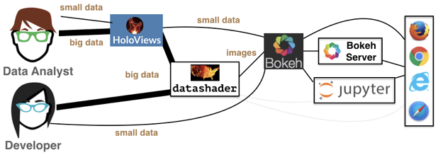
We see that the data analyst (i.e. you!) can harness the power of Datashder by using HoloViews as a convenient high-level wrapper. Just as we’ve used HoloViews as an alternative to Bokeh for the small data we’ve encountered so far, HoloViews can handle big data as well via Datashader. While you have the option to interact with Datashader (and Bokeh) directly, this is generally not necessary for our purposes.
Second, how does Datashader work?
Datashader is extremely powerful with a lot happening under the hood, especially when interfacing with HoloViews instead of Datashader directly. However, it’s important to understand how Datashader works if you want to work beyond the default settings. The Datashader pipeline is as follows:
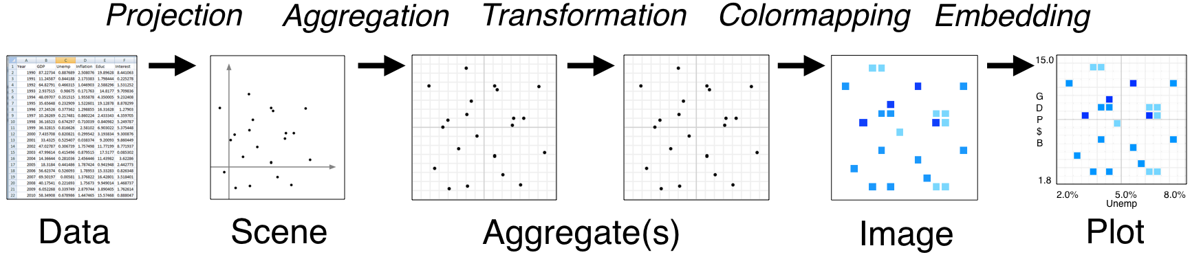
The first two steps are no different from what we’ve seen so far.
We start with a (tidy!) dataset that is well annotated for easy plotting.
We select the scene which we want to ultimately render. We are not yet plotting anything: we are just specifying what we would like to plot. That’s what we were doing when we called
points = hv.Points(
data=df,
kdims=['log₁₀ SSC-A', 'log₁₀ FSC-A'],
)
The next step is where the Datashader magic comes in.
Aggregation is the method by which the data are binned. In the example above, we binned by count, although there are other options. The beauty of Datashader is the this aggregation is re-computed quickly whenever you zoom in on your plot. This allows for rapid exploration of how your data are distributed at any scale.
Color mapping is the process by which the quantitative information of the aggregation is visualized. The default color map used above was varying shades of blue, but we could easily use a different color map by using the
cmapkeyword argument of the datashade operation.
[9]:
# Datashade
hv.operation.datashader.datashade(
points,
cmap=list(bokeh.palettes.Magma10),
).opts(
width=350,
height=300,
padding=0.05,
show_grid=True,
)
Data type cannot be displayed:
[9]:
And lastly comes the plotting.
As mentioned previously, Datashader is not a plotting package, but it computes rasterized images that can then be rendered nearly effortlessly with HoloViews or other plotting packages.
Now that we have a better handle on how Datashader work, let’s play around with more some more options.
Dynamic spreading
On some retina displays, a pixel is very small and seeing an individual point is difficult. To account for this, we can also apply dynamic spreading which makes the size of each point bigger than a single pixel.
[10]:
# Datashade with spreading of points
hv.operation.datashader.dynspread(
hv.operation.datashader.datashade(
points,
)
).opts(
width=350,
height=300,
padding=0.05,
show_grid=True,
)
Data type cannot be displayed:
[10]:
Datashading paths random walk
Datashader also works on lines and paths. In one of the rare cases where we do not use real data, I will use Datashader to visualize the scale invariance of random walks. First, I will generate a random walk of 10 million steps. For each step, the walker take a unit step in a random direction in a 2D plane.
[11]:
n_steps = 10000000
theta = np.random.uniform(low=0, high=2*np.pi, size=n_steps)
x = np.cos(theta).cumsum()
y = np.sin(theta).cumsum()
We will plot it as a datashaded path.
[12]:
hv.operation.datashader.datashade(
hv.Path(
data=(x, y),
kdims=['x', 'y']
)
).opts(
frame_height=300,
frame_width=300,
padding=0.05,
show_grid=True,
)
Data type cannot be displayed:
[12]:
Computing environment
[13]:
%load_ext watermark
%watermark -v -p numpy,pandas,bokeh,holoviews,datashader,bootcamp_utils,jupyterlab
CPython 3.7.7
IPython 7.13.0
numpy 1.18.1
pandas 0.24.2
bokeh 2.0.2
holoviews 1.13.2
datashader 0.10.0
bootcamp_utils 0.0.6
jupyterlab 1.2.6